Tinder Let's Meet
Industry
Social Media
Client
Tinder
Role
Lead Designer
Timeframe
2023
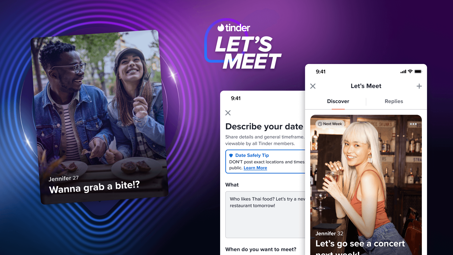
Let's Meet is a Tinder Explore feature where users can post a date idea and have others respond to date ideas/requests without the friction of the swipe, match, conversation, contact exchange funnel. It is a scrolling feed where users can either post dates and receive replies, or see posts and reply, to give them a more direct route to meeting IRL.
HYPOTHESIS
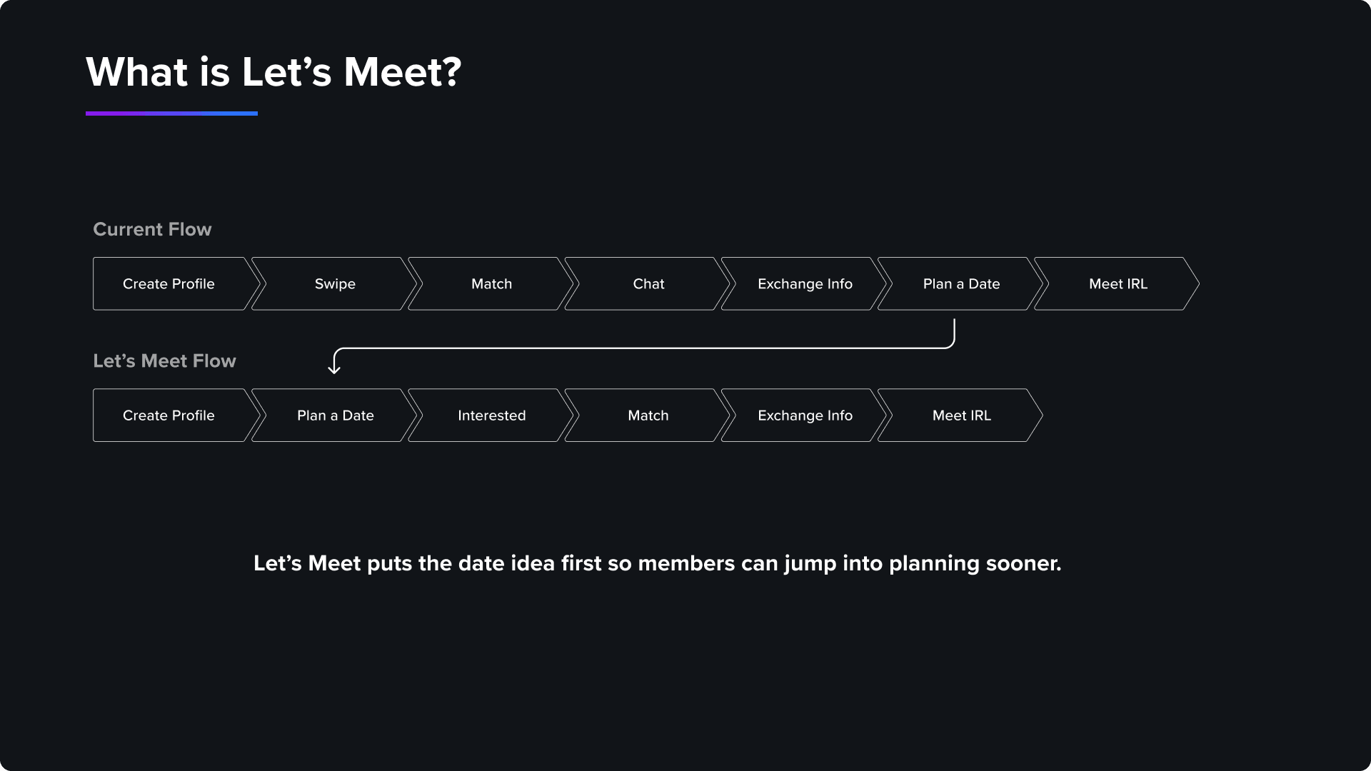
For a decade, the "swipe" has been Tinder's core mechanic. However, as users seek new ways to connect, simply offering more opportunities to swipe has led to diminishing engagement. "Let's Meet" was designed to break the traditional swipe-match-message funnel.
Our hypothesis was that by allowing users to post date ideas to a public feed and get direct responses, we could create a frictionless path to real-world meetups, ultimately increasing conversations and confirmed dates especially within Tinder's Gen Z target market.
OPPORTUNITIES & INSIGHTS
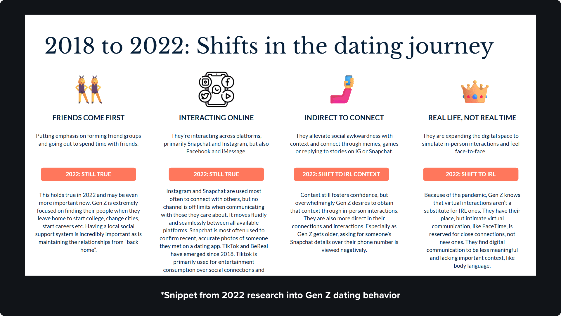
Historically, Tinder’s Explore page struggled with low engagement because it failed to differentiate itself from the core swiping experience. To understand how to pivot, we looked closely at our growing Gen Z user base. Research revealed that this demographic is experiencing digital fatigue and craving "realness." They are eager to transition from endless online interactions to becoming real-world explorers. Most importantly, we discovered that for these users, transitioning quickly to an in-person meetup isn't just a preference, it’s their primary coping mechanism for overcoming online dating anxiety.
LET'S MEET v1 FLOWS
ENTRY POINTS
Rather than burying the new feature in a single tab, we designed consistent entry points across Tinder’s existing pages. By weaving these pathways into the main Discovery experience and primary Explore tiles, we maximized visibility while keeping the user's navigation natural and intuitive.
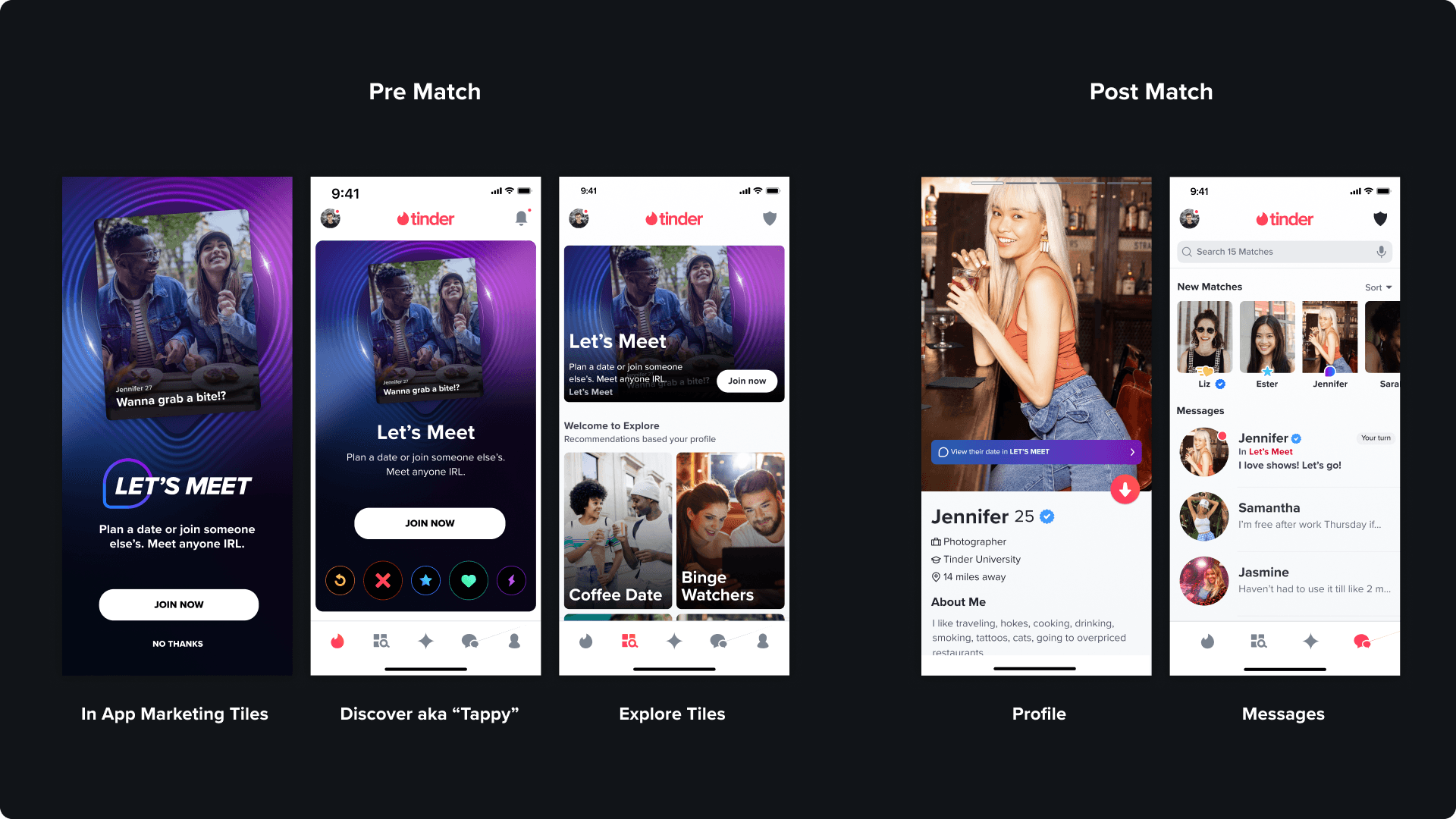
FEED
To ensure the feature felt active and engaging from the very first tap, we prioritized content discovery. The moment a user opens "Let's Meet," they are greeted by a localized, vertically scrolling feed of real date ideas posted by people nearby even if they have not matched with them. By breaking the standard swipe mechanics and relying on familiar feed interactions, we created an intuitive space where users can effortlessly browse opportunities, signal interest, and transition from online browsing to offline meeting with minimal friction.

ADD A DATE
We wanted the transition from consumer to creator to feel organic rather than forced. At any point during their browsing experience, users have the option to publish their own date idea to the feed. By keeping this action strictly optional and avoiding forced participation walls, we ensured that users who prefer a more passive browsing experience remain engaged without feeling pressured to create content.

REPLIES
Once a user publishes a date idea, they need a way to manage their inbound interest. We designed a dedicated Replies tab where users can review the profiles of interested candidates before initiating a match. Strategically, this is one of the only touchpoints within Tinder where free-tier users can see who liked them prior to swiping. This is normally a premium perk reserved for Tinder Gold subscribers.
After liking someone in the replies tab, it becomes an instant match. After this, they can continue into messages with a callback to the date idea for an easy ice breaker promoting 2-way and 4-way conversations.

OTHER CONSIDERATIONS
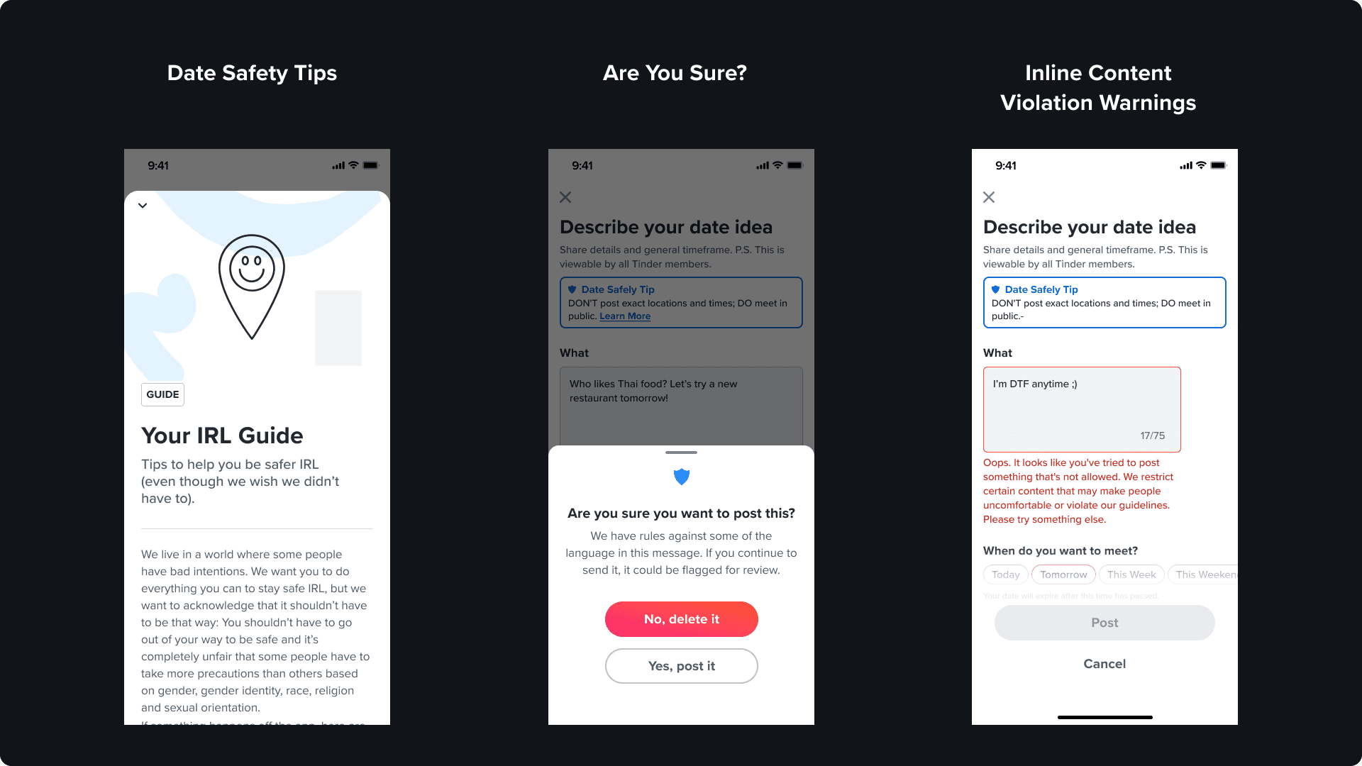
USER GENERATED CONTENT SECURITY
Because the core goal of "Let's Meet" is to accelerate the transition from online matching to in-person meetups, protecting our users in the physical world was paramount. Throughout the entire design and development cycle, we worked with Tinder’s Trust & Safety team. By actively collaborating with security experts, we were able to embed proactive safety checks and guardrails directly into the flow, ensuring that reducing friction for real-world connections never came at the expense of user well-being.
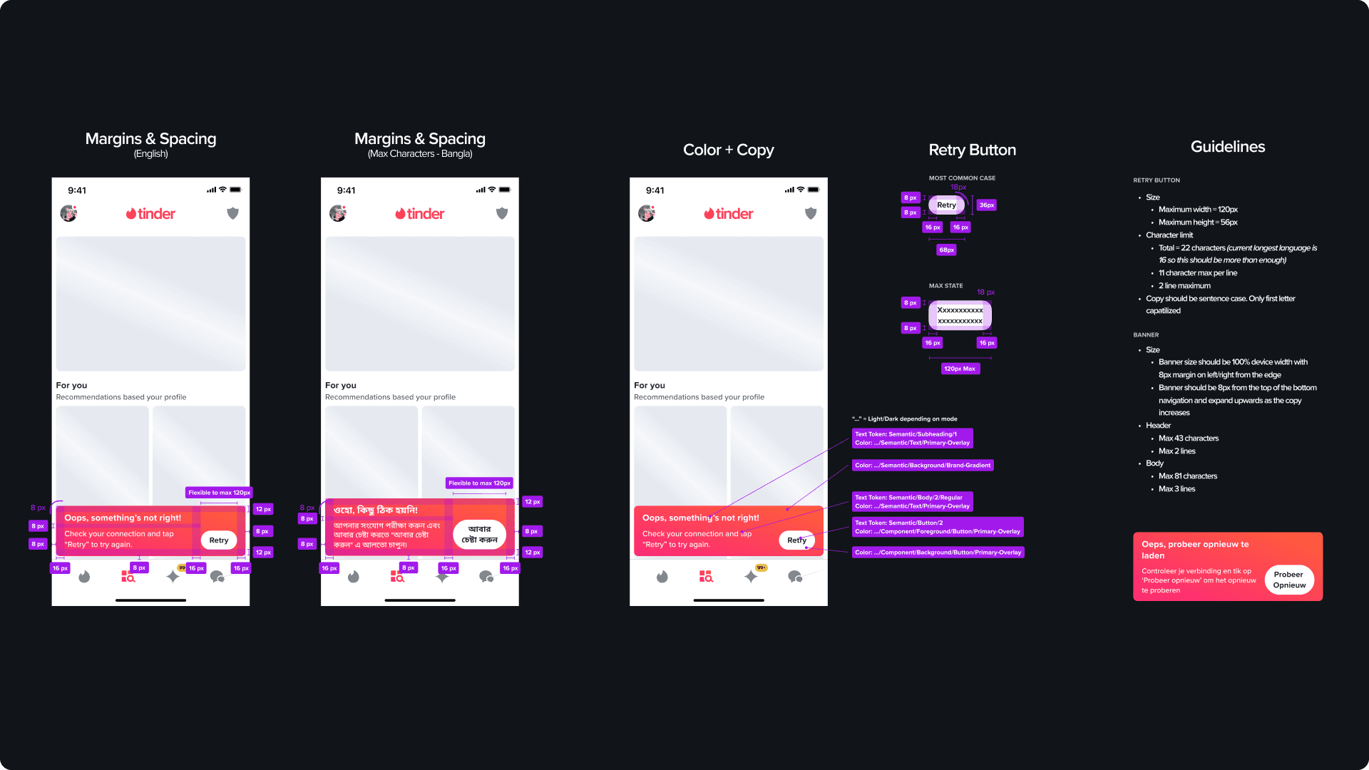
LOCALIZATION
Because Tinder operates on a massive international scale, we couldn't design "Let's Meet" strictly through an English speaking lens. We had to ensure our UI components were flexible enough to accommodate significant text expansion and diverse language structures without compromising the visual hierarchy. We launched our MVP test in two distinct and diverse markets: Thailand and Denmark. This phased rollout allowed us to validate the design's adaptability and ensure the experience felt polished before scaling globally.
IMPACT & RESULTS
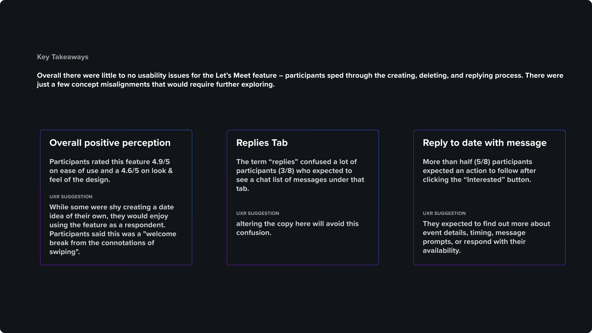
Initial user testing strongly validated the "Let's Meet" concept, with participants praising the experience as a "welcome break from the connotations of swiping." Beyond our primary goals, the test showed a significant increase in the swipe right rate (aka liking) among women. This was a historically difficult metric to improve for any Tinder feature so it was a very pleasant surprise for the team.
From a usability standpoint, the design was a resounding success. Users effortlessly navigated the creation and reply flows without friction. However, the research highlighted a distinct behavioral split. Many users preferred to act as respondents rather than creators. This insight reaffirmed our decision to build a non-blocking, browsing-first experience.
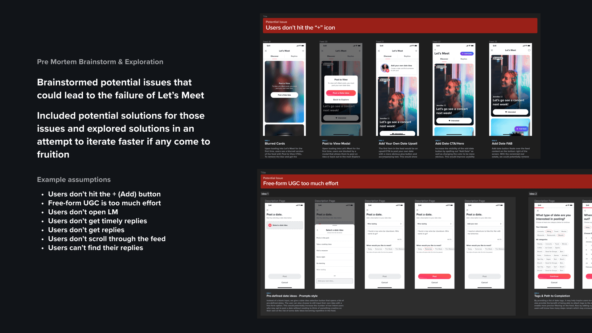
MOVING FORWARD
For the first time, our team utilized a "pre-mortem" framework which consisted of brainstorming solutions to anticipated UX hurdles before the MVP data even rolled in. This proactive strategy allowed us to pivot into our next phase of iteration immediately. In addition to addressing usability issues and bugs, our roadmap is focused on two primary pillars: seamlessly interweaving "Let's Meet" into the main Discovery page to drive top-of-funnel awareness, and exploring sustainable monetization options to support broader business goals.