The North Face
Industry
E-commerce
Client
The North Face
Role
Lead Designer
Timeframe
2021
Working collaboratively with The North Face team on this project titled #Vanlife (long story), we redesigned the homepage and all site components to improve the brand look and feel and match their new in-store marketing updates on the digital side. The newly designed components were then converted into a massive, 1,200 symbol design system and new brand style guide for the in-house designers and developers.
GOAL
Through early stakeholder interviews, we found that The North Face wants to be perceived as a higher value brand to be equated with competitors such as Patagonia. It was our goal to take advantage of the upcoming technology stack upgrade and provide a new front end look and feel to do just that. Not only did they want the brand to look more premium but we saw an opportunity to make the designers and developers lives easier by providing an extensive design system that could be white labeled for other VF Corp brands.
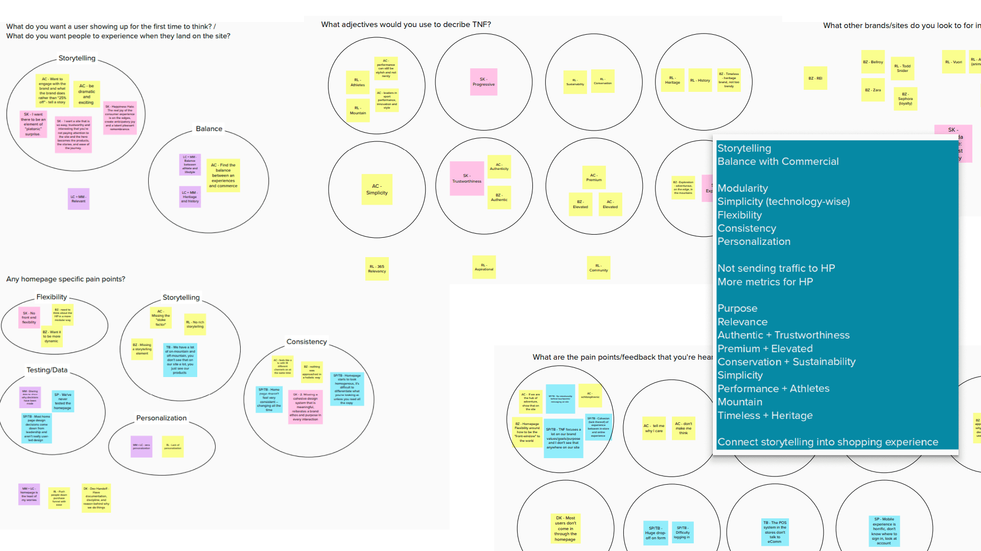
STAKEHOLDER INTERVIEWS & COMPETITIVE ANALYSIS
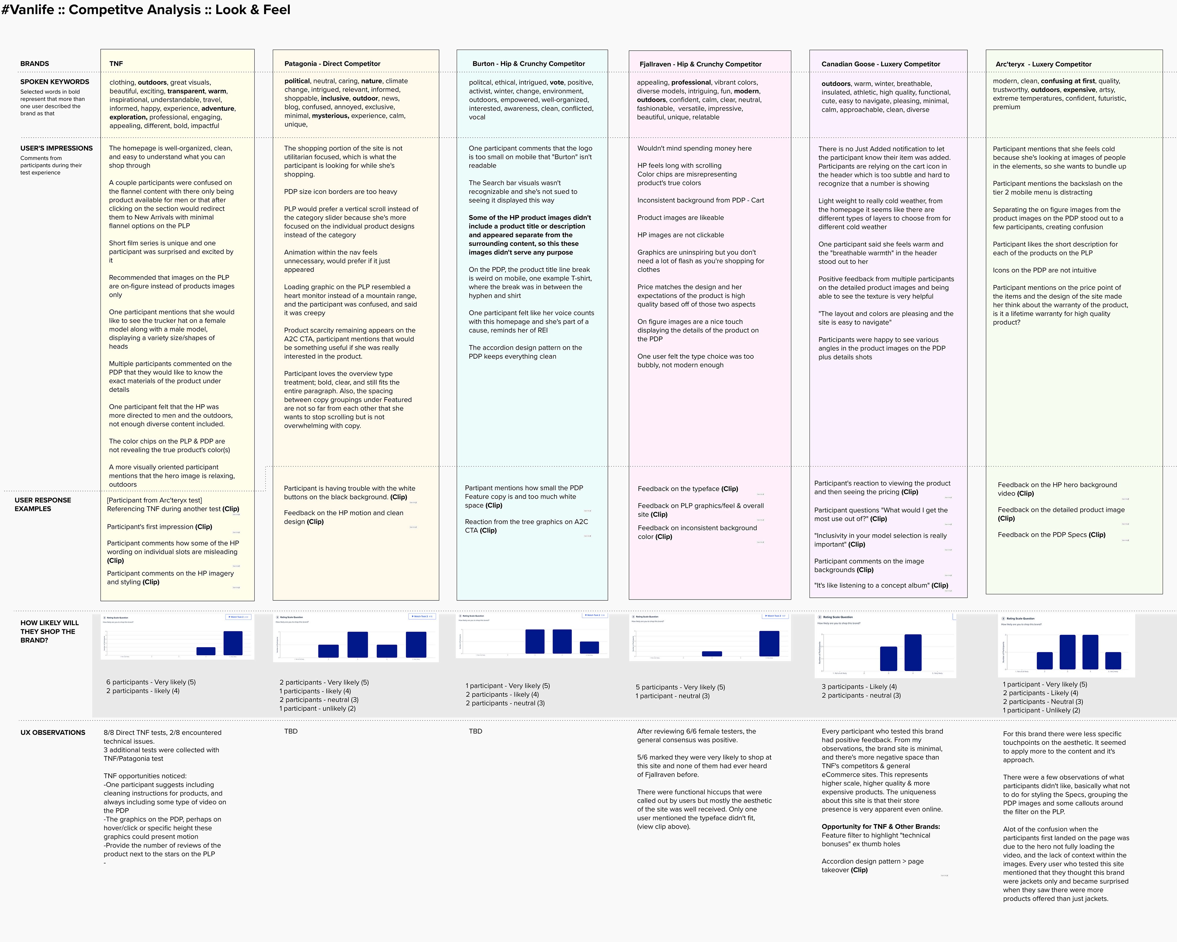
The project started with interviews of the various stakeholders who are subject matter experts in different parts of the TNF brand. We discovered many pain points that the stakeholders and users had with the brand’s current status and got direction on what was expected from each. Some of the primary bits of feedback we heard was that TNF is starting to fall behind in their visual representation when it comes to modern design standards. We consistently heard words like “premium,” “timeless,” “minimal,” and “elevated” as themes for the vision of what our work would help convey. After we gathered the stakeholder feedback we did a competitive analysis of other similar brands in the same space as well as other high end ecomm brands.
ICONOGRAPHY
One of the first steps taken to move the visual design into a more consistent and elevated direction was to create a brand new icon set from scratch. The current TNF icon set was clearly taken from a bunch of different icon sets so there were massive inconsistencies between each icon. Some were filled, some were outlines and the sizing was all over the place. This made the site look a bit amateurish and definitely didn’t hit the “elevated” look and feel that the brand was looking for. After a ton of exploration and feedback from the brand and users, the direction that was decided on was an outline style with a bit of extra roundness.
TYPOGRAPHY
Another opportunity for change was to update the typography. The North Face has traditionally used a lot of all caps Helvetica on their site to match the iconic Half Dome logo type lockup. We didn’t want to move away from Helvetica since it does have such a deep brand connection, but we changed the way it was being used pretty extensively on all areas from headers to body copy to CTAs. Another common theme we heard in the initial interviews was that the TNF website feels very masculine and sharp because of the “yelly” all caps usage and bold fonts. I made it a point to remove any usage of all caps as well as use the “medium,” 500 weight of Helvetica as the boldest variation used. This helped introduce some delicate femininity that was previously absent.
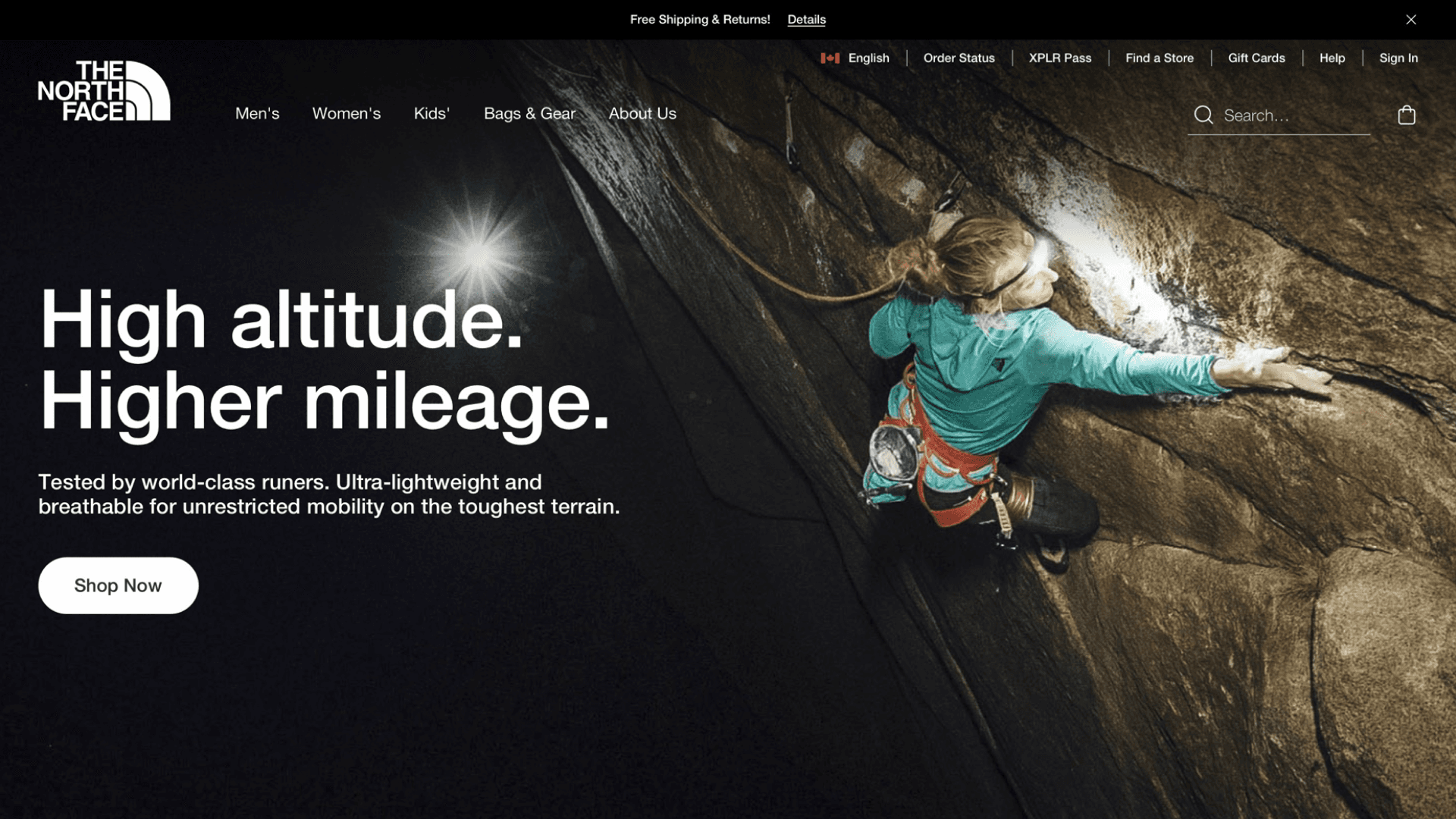
HOME PAGE REDESIGN
While most of the updates in this project were on the aesthetic side, one area that we had a bit more freedom to improve functionality on was the home page. There was a huge appetite from the site CMS authors to get more unique “building blocks” on the home page to be able to create more interesting landing pages for various different brand storytelling and commercial moments. The current site suffers from some very tight padding and margins as well as a little too much consistency between the components. I took all of this into account when creating the new look and feel to make sure that the users who landed there are met with a nice overall visceral aesthetic that really drew them in as well as keeping the components reusable for the brand.

INTERIOR PAGE UPDATES
The updates didn’t stop with the homepage. It was important that all of the improvements made for the components are propagated into the rest of the site as well to ensure overall consistency. I focused on a few key pages and flows to get feedback and test with users to make sure we were hitting the mark in all areas. While changing the functionality and overall layout was out of scope for these pages, I was able to create a visual improvement by updating the typography, spacing and color usage of the pages. All of the big changes were A/B tested against production to ensure there were no regressions in conversion.
USER TESTING & VALIDATION
Throughout the design process, I worked with the UX researcher on our team to test over 1,000 users on usertesting.com to ensure that we were on the right track. While testing visual design is pretty difficult, we found some methodologies that helped us get the feedback we needed. We did a lot of A/B tests through usertesting.com as well as working with the TNF team to use Monetate and A/B test on the live site with millions of impressions to make sure there were no regressions to conversion. We got some surprising results using this method. For instance, removing the review stars on the product landing page cards actually increased conversion and overall revenue slightly.
The other method we used often was a blind user perception test. By removing The North Face logo from the UI and all products displayed on the page, we asked sets of users what they thought each product would cost as well as what brand they thought it was. This led to some very interesting results but overall, the new designs tested out positive producing a consistently higher overall perceived price point. The users also tended to reference higher end brands when presented with these designs.
ATOMIC DESIGN SYSTEM
After the initial direction was approved by both the brand and users, the next big step was to create a massive, 1,200 symbol atomic design system library. Every single component used in the website was updated to the new style and added to the design system to improve the designer and developer experience and decrease the amount of time it takes to create design deliverables for the team. The tools used to create this system were Sketch working with Abstract for versioning and library linking. All of the current production pages were remade as templates in the system that all link back to the original atomic library so that any future iterations are propagated through to every page.
BRAND NEW TNF STYLE GUIDE
Because almost every single component on the site was updated with this project, it was necessary to create a style guide to display all the unique components as well as document usage guides around each. TNF developers were extremely excited about this as they never had an up-to-date guide before. Everything from animation timings to when and how to use buttons has been meticulously documented here to ensure that, not only in-house designers and devs know this, but also getting third party vendors that TNF works with immediately up to speed on the styles.
CONCLUSION
Overall the project took approximately 4-5 months from concept to completion. In that time we redesigned every component within the thenorthface.com, tested and validated with over 1,000 users, and created a 1,200 symbol design system and style guide to ensure consistency across all future brand engagements. While there are still not exact metrics around the time-to-market for the design team, I think the initial goal was more than reached. The site improvements launched to production in late August 2021, and the design system improvements immediately made a huge impact within the internal design teams. This project was met with extreme positivity from everyone within The North Face brand team from the Presidents to each individual contributing member of the design and development team and I am proud to have been the design lead on this project!